Create a Treemap chart in Retool
This post is a bit old and outdated.
Rechart has evolved in the meantime.
Please refer to the more recent posts from here
A treemap is a technique for visualizing hierarchical data by using rectangles nested within each other. Treemap charts are created using this technique for data visualization.
Treemap charts represent hierarchical data as tree structures. Data are represented as branches and subbranches by rectangles, whose dimensions and colors are determined by the quantitative variables associated with each rectangle: each rectangle represents two numerical values. Data can be drilled down to, in theory, an unlimited number of levels. This makes it easy to distinguish at a glance between categories and data values.
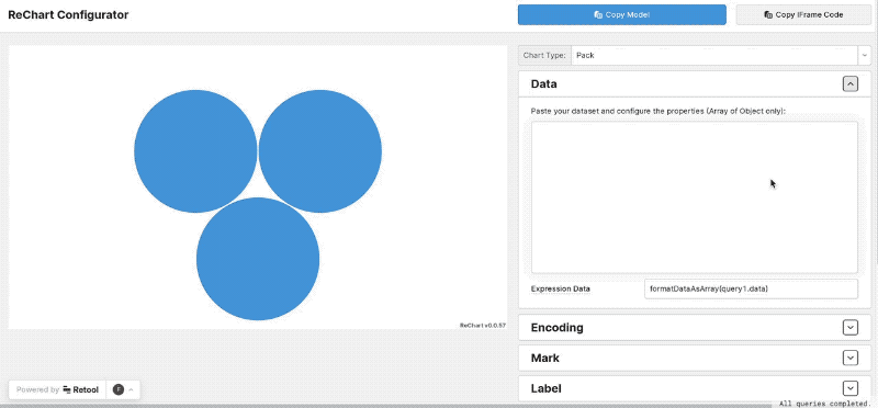
In Retool you can, for sure, create a treemap chart using the build-in Plotly component using (and messing with) a custom JSON configuration.
If you want to skip that way, you can use Rechart, our javascript library that allows to add powerful charts easily in Retool using the custom compontent as host.
Here a simple treemap configured visually using our configurator (a Retool app):
Here a list of what you can configure in this current treemap implementation:
- define one or more dimensions for the rect size
- define color scale or custom colors as well
- custom labels in html and css on the treemap rectangles
- customize the tooltip in html and css
- interactive drill-down capability
- selection capability to cmmunicate with other components
If there’s something missing, let us know!